HTML Structure
Setting the panel
Scripts and styles responsible for the output and settings of the the panel:
directory site.../custom_tools/css/colorpicker.css
directory site.../custom_tools/js/jquery.cookie.js
directory site.../custom_tools/js/colorpicker.js
directory site.../custom_tools/js/custom-block.js
Adding the panel:
directory site.../js/_front.js - line 1
jQuery(document).ready(function(){
include Custom.JS
    jQuery('head').append('<link rel="stylesheet" type="text/css" media="all" href="custom_tools/css
    /colorpicker.css">');
    jQuery('head').append('<script type="text/javascript" src="custom_tools/js/jquery.cookie.js">
    </script>');
    jQuery('head').append('<script type="text/javascript" src="custom_tools/js/colorpicker.js">
    </script>');
    jQuery('head').append('<script type="text/javascript" src="custom_tools/js/custom-block.js">
    </script>');
});
Homepage
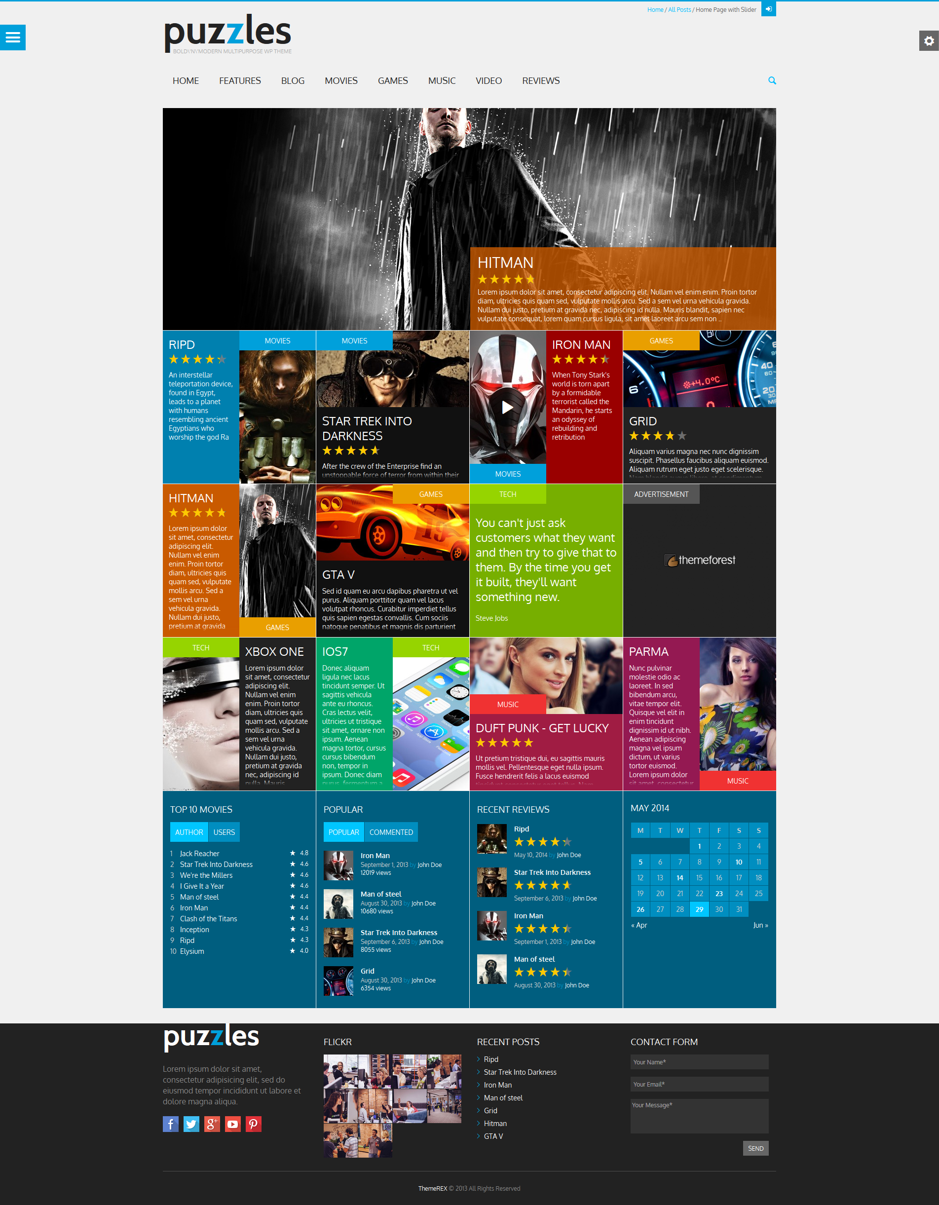
Homepage Style "Puzzles"
The picture below demonstrates the variant of the page:
To add the block (Pazzle Item), you need to insert the following code into the content:
<div class="sc_blogger_item sc_blogger_item_puzzles">
  <div class="post_thumb image_wrapper left-1">
    <a href="[url]"><img alt="" src="[url]"></a>
      <span class="post_format theme_accent_bg icon-doc-text" data-categoryiconbg="[color]"></span>
      <span class="post_category theme_accent_bg" data-categoryiconbg="[color]">Tech</span>
      <div class="post_content_wrapper theme_puzzles" data-puzzlecolor="[color]">
        <h2 class="post_subtitle"><a href="[url]">Lorem Ipsum</a></h2>
        <div class="post_descr"><p>Donec aliquam ligula...</p></div>
      <div class="post_content_padding theme_puzzles"></div>
    </div>
  </div>
</div>
In Pazzle Item, you can set animation variant and set any color scheme.
The Animation can be of two variants. To set it, you need to find the element with the class "post_thumb" and add one of the classes to it:
<div class="post_thumb [...] left-1">
<div class="post_thumb [...] left-2">
<div class="post_thumb [...] right-1">
<div class="post_thumb [...] right-2">
<div class="post_thumb [...] down-1">
<div class="post_thumb [...] down-2">
Background color can be changed for two pop-up icons and the block with text. Pop-up icons have classes "post_format" and "post_category". To change their background you need to indicate the color using data-parameter "data-categoryiconbg". For example:
<span class="post_format [...]" data-categoryiconbg="00a0db"></span>
<span class="post_category [...]" data-categoryiconbg="0080af">Movies</span>
To change the background of the block with text, you need to find the element with the class "post_content_wrapper" and indicate the color using data-parameter "data-puzzlecolor"
<div class="post_content_wrapper [...]" data-puzzlecolor="0080af">
These data-parameter are not mandatory. If they are not specified, the background color will be the same as the page's color theme.
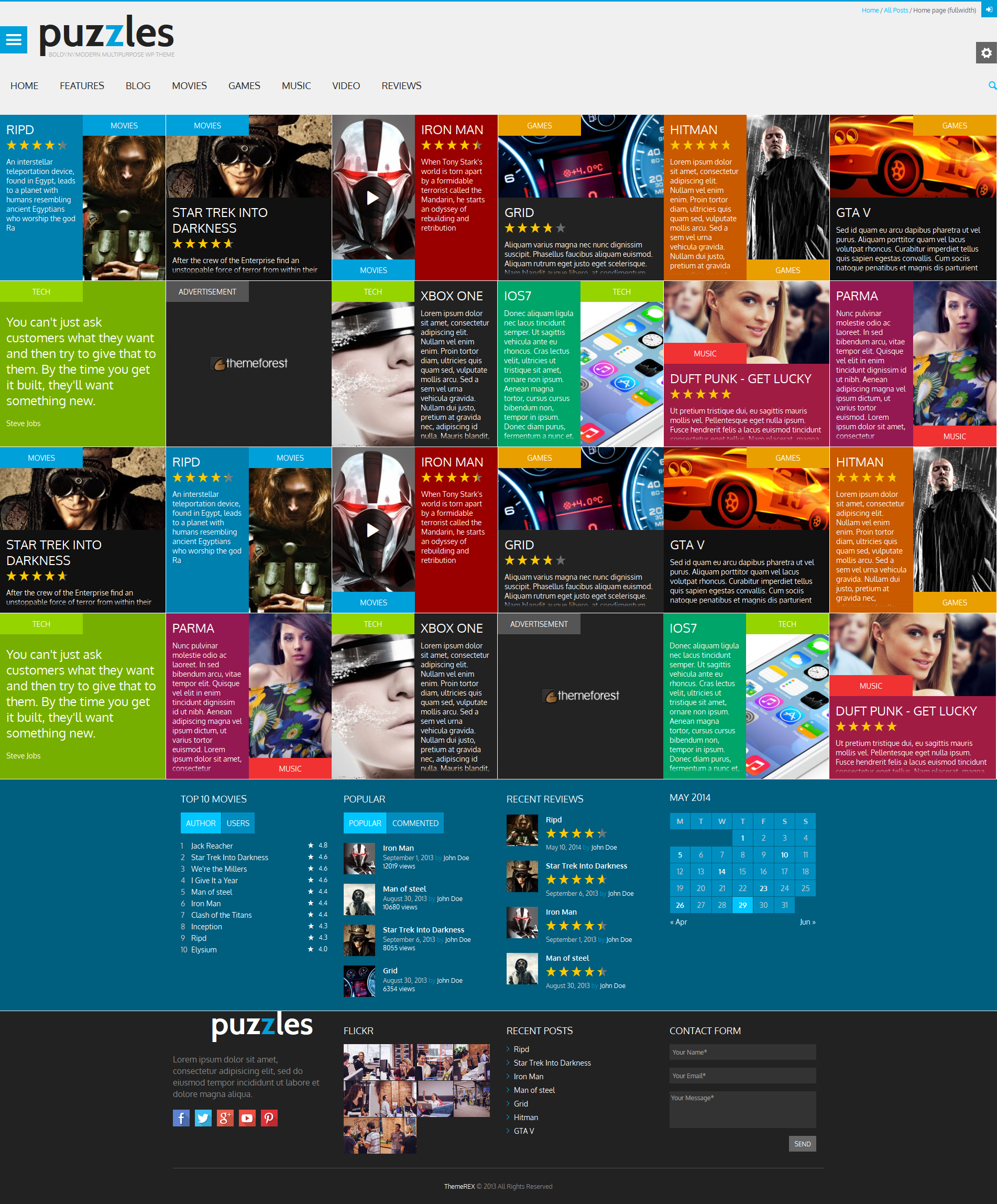
Homepage (fullwidth)
Here is an example of fullwidth homepage:
To set fullscreen mode, you need to add class "fullwidth" for <body>
<body class="[...] fullwidth">
Homepage (classic style)
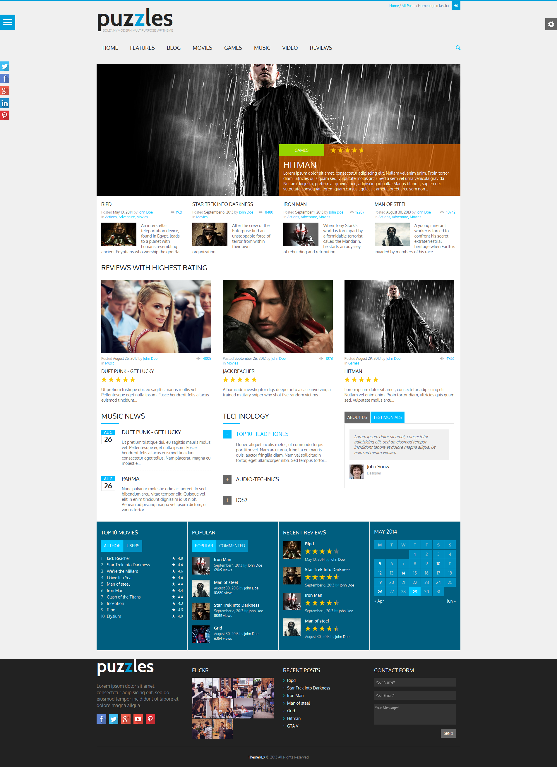
Here is another variant of homepage. This time we are going to design it in classic style:
The picture below demonstrates the variant of the page:
Background and color
You can change the background by adding class into the tag <body>
<body class="[...] bg_pattern_1">
<body class="[...] bg_pattern_2">
[...]
<body class="[...] bg_pattern_5">
<body class="[...] bg_image_1">
<body class="[...] bg_image_2">
<body class="[...] bg_image_3">
Main Slider
In Main Slider, the path to the slider's picture is set via data-parameter "data-slide". You can also change the background color for each slide's description. This color is set using data-parameter "data-slidetextbg".
To enable Main Slider, you need to insert the following colde:
<div id="main_slider" class="main_slider_fixed">
  <div id="main_slider_inner">
    <div class="sc_slider sc_slider_flex">
      <ul class="slides">

        <!-- slider item -->
        <li data-slide="[url_slide]">
          <div class="sc_slider_info theme_accent_bg" data-slidetextbg="[color]">
            <h2 class="sc_slider_subtitle"><a href="[url_link]">Lorem ipsum</a></h2>
            <div class="sc_slider_descr">Donec aliquam ligula nec ...</div>
          </div>
        </li>
        <!-- /slider item -->

        [...]

        <!-- slider item -->
        <li data-slide="[url_slide]">
          <div class="sc_slider_info theme_accent_bg" data-slidetextbg="[color]">
            <h2 class="sc_slider_subtitle"><a href="[url_link]">Lorem ipsum</a></h2>
            <div class="sc_slider_descr">Donec aliquam ligula nec ...</div>
          </div>
        </li>
        <!-- /slider item -->

      </ul>
    </div>
  </div>
</div>
Menus
The theme supports two independent menu styles:
- Main menu - main menu of the webiste as horizontal line in the area of page title:

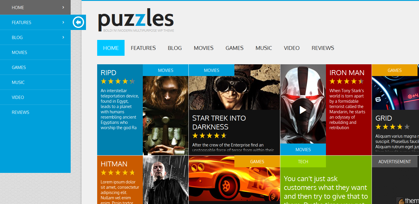
- Side menu - side menu of the webiste (vertical) that shows up when clicking on the button
 in the left upper part of the page. When open, the menu looks like this:
The code below is responsible for the Main menu's output:
<!-- main menu -->
<nav id="mainmenu_area" class="mainmenu_area theme_menu" role="navigation">
<ul id="mainmenu">
  <li class="lightblue">
    <a href="index.html">Home</a>
    <ul class="sub-menu">
      <li class="current-menu-item"><a href="index1.html">Homepage with Slider</a></li>
      [...]
    </ul>
  </li>
  [...]
  <li><a href="excerpt-style2.html">Reviews</a></li>
</ul>
<a href="#" class="search_link"><span class="icon-search"></span></a>
</nav>
<!-- #main menu -->
The code below is responsible for the Side menu's output::
<!-- side menu -->
<nav id="sidemenu_area" class="sidemenu_area theme_accent_bg" role="navigation">
  <a href="#" id="sidemenu_link" class="icon-menu theme_accent_bg"></a>
  <div id="sidemenu_scroller_wrapper">
    <div id="sidemenu_scroller">
      <ul id="sidemenu">
        <li class="lightblue">
          <a href="index.html">Home</a>
          <ul class="sub-menu">
            <li class="current-menu-item"><a href="index1.html">Homepage with Slider</a></li>
            [...]
          </ul>
        </li>
        [...]
        <li class="black"><a href="excerpt-style2.html">Reviews</a></li>
      </ul>
    </div>
  </div>
</nav>
<!-- #side menu -->
Sidebar widget example
Every widget is enclosed into tag <aside>...</aside> that has the "widget" class:
<!-- widget categories -->
<aside class="widget widget_categories">
<h3 class="widget_title theme_title">Categories</h3>
<ul>
<li><a href="[url]" title="">Advertisement</a></li>
[...]
</ul>
</aside>
<!-- widget categories -->
Single post example
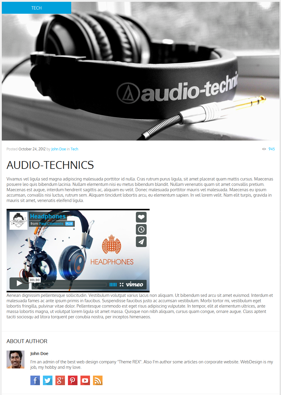
<article class="theme_article post_format_video instock">
<div class="post_thumb image_wrapper no_thumb">
<img src="http://placehold.it/932x465" itemprop="image" alt="">
<span class="post_format theme_accent_bg icon-video"></span>
<span class="post_category theme_accent_bg">Tech</span>
</div>
<!-- Post content -->
<div class="post_content">
<!-- Post info -->
<div class="post_info post_info_top theme_info">
Posted
<span class="post_date theme_text date updated" itemprop="datePublished" >October 24, 2012</span>
<span class="post_author">by <span class="vcard author" itemprop="author">
<a href="excerpt-style1.html" class="post_author fn" rel="author">John Doe</a>
</span></span>
<span class="post_cats">in <a class="cat_link" href="excerpt-style4.html">Tech</a> </span>
<span class="post_comments">
<a href="single-format-video.html">
<span class="comments_icon theme_info icon-eye"></span>
<span class="comments_number">945</span>
</a>
</span>
<meta itemprop="interactionCount" content="UserPageVisits:945" />
</div>
<!-- /Post info -->
<div class="title_area">
<h1 itemprop="name" class="post_title theme_title entry-title">Audio-technics</h1>
</div>
<div itemprop="articleBody" class="post_text_area">
<p>Vivamus vel ...</p>
<iframe class="video_frame" src="http://player.vimeo.com/video/33174546" width="480"
height="280" allowFullScreen="allowFullScreen"></iframe>
<p>Aenean dignissim pellentesque ...</p>
</div>
</div>
<!-- #Post content -->
</article>
Contact form
An e-mail of a message receiver from the contact form can be specified in the filedirectory site...include/sendmail.php, line 13:
$contact_email = 'your_mail@mail.com';
Shortcodes
Shortcodes are a cool feature that essentially allows you to do some pretty incredible things by just inserting a shortcode into a page. Using Shortcodes is a breeze, just insert one where you want the relevant content to show up.
Here's a list of the shortcodes included in Puzzles theme.
Accordion
Creates blocks of the "accordion" type . Attention: at the same time only one of the blocks can be open
<!-- accordion -->
<div id="accordion_1" class="sc_accordion">
<div class="sc_accordion_item">
<h5 class="sc_accordion_title">
<a href="#"><span class="sc_accordion_icon"></span>Title 1</a>
</h5>
<div class="sc_accordion_content">Lorem ipsum dolor ...</div>
</div>
<div class="sc_accordion_item">
<h5 class="sc_accordion_title">
<a href="#"><span class="sc_accordion_icon"></span>Title 2</a>
</h5>
<div class="sc_accordion_content">Lorem ipsum dolor sit amet...</div>
</div>
<div class="sc_accordion_item">
<h5 class="sc_accordion_title">
<a href="#"><span class="sc_accordion_icon"></span>Title 3</a>
</h5>
<div class="sc_accordion_content">Lorem ipsum dolor sit ...</div>
</div>
</div>
<!-- /accordion -->
Toggles
Creates blocks of the "toggles" type. Comparing to the "accordion" you can close all the blocks or open more than one.
<!-- toggles -->
<div class="sc_toggles">
<div class="sc_toggles_item first">
<h5 class="sc_toggles_title ui-state-active">
<a href="#"><span class="sc_toggles_icon"></span>Title 1</a>
</h5>
<div class="sc_toggles_content">Proin sem libero...</div>
</div>
<div class="sc_toggles_item">
<h5 class="sc_toggles_title ui-state-active">
<a href="#"><span class="sc_toggles_icon"></span>Title 2</a>
</h5>
<div class="sc_toggles_content">Duis et consectetur ...</div>
</div>
<div class="sc_toggles_item">
<h5 class="sc_toggles_title ui-state-active">
<a href="#"><span class="sc_toggles_icon"></span>Title 3</a>
</h5>
<div class="sc_toggles_content">Sed eu tellus eu ...</div>
</div>
</div>
<!-- toggles -->
Audio
Inserts an audio file.
<div class="audio_container">
<audio src="http://somesite.com/audio/filename.mp3" class="sc_audio" controls="controls"></audio>
</div>
Puzzles
To learn more about how to enable and set the display of the "Puzzles" block visit this section.Button
Creates different types of buttons.
The classes below are responsible for the button's sizes:
- sc_button_size_small
- sc_button_size_medium
- sc_button_size_large
The classes below are responsible for the button's color:
- sc_button_style_regular
- sc_button_style_grey
- sc_button_style_red
- sc_button_style_green
- sc_button_style_blue
If the button has a class "theme_button", it will be of the same color as the page.
Buttons look like the following:

<a href="#" class="sc_button sc_button_style_regular sc_button_size_small">Small Button</a>
<a href="#" class="sc_button sc_button_style_grey theme_button sc_button_size_medium">Medium Button</a>
<a href="#" class="sc_button sc_button_style_red sc_button_size_large">Large Button</a>
<a href="#" class="sc_button sc_button_style_green sc_button_size_small">Small Button</a>
<a href="#" class="sc_button sc_button_style_blue sc_button_size_small">Small Button</a>
Columns
Columns may be of such types:
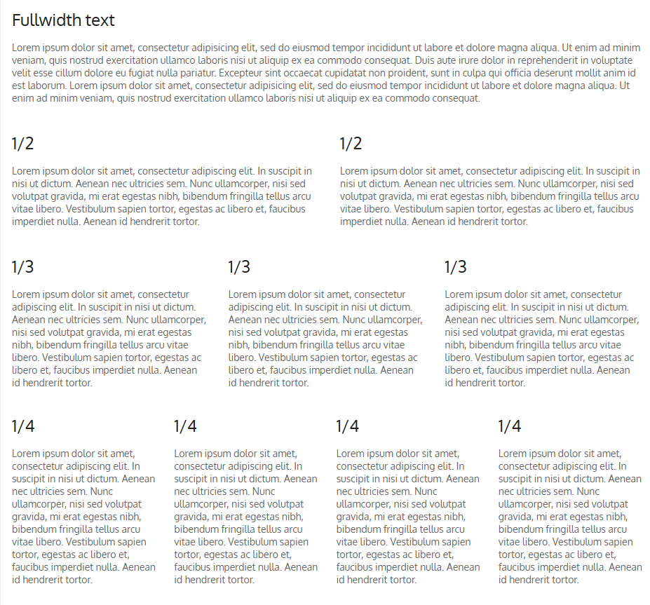
The classes below are responsible for number of columns:
- "sc_columns_count_2" - 2 columns;
- "sc_columns_count_3" - 3 columns;
- "sc_columns_count_4" - 4 columns.
Each columns must have a class "sc_column_item". For example:
<!-- 3 columns -->
<div class="sc_columns sc_columns_count_3">
<div class="sc_column_item sc_column_item_1 first">
<h2>1/3</h2>
<p>Lorem ipsum dolor ...</p>
</div>
<div class="sc_column_item sc_column_item_2">
<h2>1/3</h2>
<p>Lorem ipsum dolor...</p>
</div>
<div class="sc_column_item sc_column_item_3">
<h2>1/3</h2>
<p>Lorem ipsum dolor ...</p>
</div>
</div>
<!-- /3 columns -->
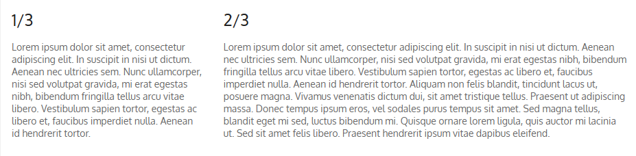
Columns can be merged. Merged columns have the class:
- "span_2" - 2 columns are merged;
- "span_3" - 3 columns are merged;
For example:
<!-- 3 columns with span_2 -->
<div class="sc_columns sc_columns_count_3">
<div class="sc_column_item sc_column_item_1 first">
<h2>1/3</h2>
<p>Lorem ipsum dolor...</p>
</div>
<div class="sc_column_item sc_column_item_2 span_2">
<h2>2/3</h2>
<p>Lorem ipsum dolor sit amet...</p>
</div>
</div>
<!-- /3 columns with span_2 -->
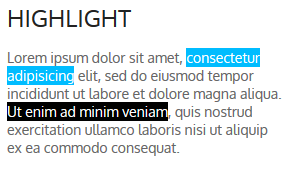
Highlight
Used to highlight a text with the font's color and / or background. Color and background are set using relative data-parameters:
- data-highlightcolor="[color]" - text color
- data-highlightbg="[color]" - text background
<p>Lorem ipsum dolor sit amet,
<span class="sc_highlight" data-highlightcolor="ffffff" data-highlightbg="00bcff">consectetur
adipisicing</span>
elit, sed do eiusmod tempor incididunt ut labore et dolore magna aliqua.
<span class="sc_highlight" data-highlightcolor="ffffff" data-highlightbg="000000">Ut enim ad minim
veniam</span>,
quis nostrud exercitation ullamco laboris nisi ut aliquip ex ea commodo consequat.</p>
Dropcaps
Used to create the dropcaps effect - special highlighting of the first letter in a paragraph.
Dropcaps look like following:
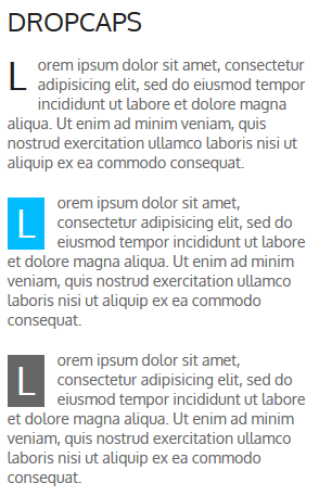
The classes used:
- sc_dropcaps_style_1
- sc_dropcaps_style_2
- sc_dropcaps_style_3
Selected symbol has "sc_dropcap" class.
<div class="sc_dropcaps sc_dropcaps_style_1"><span class="sc_dropcap">L</span>orem ipsum ...</div>
<div class="sc_dropcaps sc_dropcaps_style_2"><span class="sc_dropcap">L</span>orem ipsum ...</div>
<div class="sc_dropcaps sc_dropcaps_style_3"><span class="sc_dropcap">L</span>orem ipsum ...</div>
Quote
Used to emphasize the big and small quotes in the text.
It has "sc_quote" class.
<blockquote cite="http://themerex.net" class="sc_quote">
Lorem ipsum dolor...
< cite><a href="http://themerex.net">ThemeREX</a></cite>
</blockquote>
Tooltip
Used to create pop-up tips that appear when you hover over specific piece of text.
The text has "sc_tooltip_parent" class.
Block with pop-up tip has "sc_tooltip" class.
<span class="sc_tooltip_parent">
Ut enim ad minim veniam
<span class="sc_tooltip">Tooltip title</span>
</span>
Google Map
Address for the map should be specified in site...js/_front.js, line 55:
var googleMaps = "50, Golden Gate Ave, San Francisco, CA 94102, US";
Image
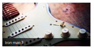
<figure class="sc_image">
<img src="[url]" alt="" />
<figcaption><span>Iron man 3</span></figcaption>
</figure>
Infobox
Creates different types of messages.
Infobox must have "sc_infobox" class. Types of messages may be of four types, each of which has its own class:
- "sc_infobox_style_regular"
- "sc_infobox_style_info"
- "sc_infobox_style_success"
- "sc_infobox_style_error"
To enable infobox, it should be assigned "sc_infobox_closeable" class.
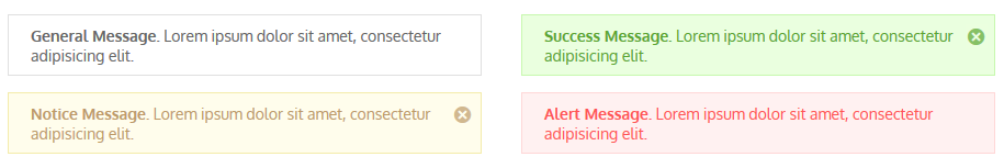
<div class="sc_infobox sc_infobox_style_regular">
<strong>General Message.</strong> Lorem ipsum dolor sit amet, consectetur adipisicing elit.
</div>
<div class="sc_infobox sc_infobox_style_info sc_infobox_closeable">
<strong>Notice Message.</strong> Lorem ipsum dolor sit amet, consectetur adipisicing elit.
</div>
<div class="sc_infobox sc_infobox_style_success sc_infobox_closeable">
<strong>Success Message.</strong> Lorem ipsum dolor sit amet, consectetur adipisicing elit.
</div>
<div class="sc_infobox sc_infobox_style_error">
<strong>Alert Message.</strong> Lorem ipsum dolor sit amet, consectetur adipisicing elit.
</div>
Line
Block with line may be of several types that have the following classes:
- sc_line_style_solid
- sc_line_style_dashed
- sc_line_style_dotted
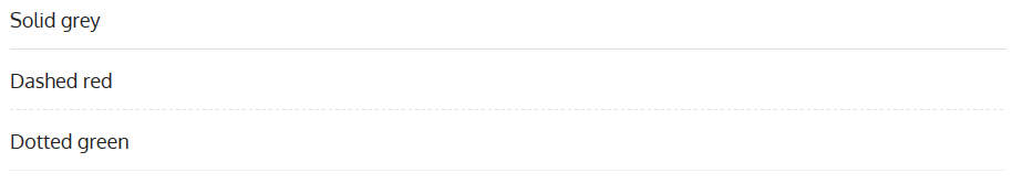
Block with line has "sc_line" class
<h3>Solid grey</h3>
<div class="sc_line sc_line_style_solid"></div>
<h3>Dashed red</h3>
<div class="sc_line sc_line_style_dashed"></div>
<h3>Dotted green</h3>
<div class="sc_line sc_line_style_dotted"></div>
List
Creates lists of different styles
Ordered and Unordered lists:
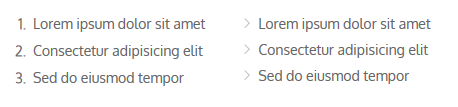
<ol>
<li>Lorem ipsum dolor sit amet</li>
<li>Consectetur adipisicing elit</li>
<li>Sed do eiusmod tempor</li>
</ol>
<ul>
<li>Lorem ipsum dolor sit amet</li>
<li>Consectetur adipisicing elit</li>
<li>Sed do eiusmod tempor</li>
</ul>
Also, lists may be of the such type:
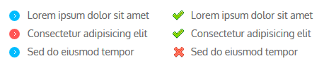
Such classes are responsible for that:
- sc_list_style_regular
- sc_list_style_check
Also, the list must have "sc_list" class.
<ul class="sc_list sc_list_style_regular">
<li class="first"><span class="sc_list_icon"></span>Lorem ipsum ...</li>
<li class="sc_list_style_mark"><span class="sc_list_icon"></span>Consectetur ...</li>
<li class=""><span class="sc_list_icon"></span>Sed do eiusmod tempor</li>
</ul>
<ul class="sc_list sc_list_style_check">
<li class="first"><span class="sc_list_icon"></span>Lorem ipsum dolor sit amet</li>
<li><span class="sc_list_icon"></span>Consectetur adipisicing elit</li>
<li class="sc_list_style_error"><span class="sc_list_icon"></span>Sed do eiusmod tempor</li>
</ul>
Skills
Shows the levels of your abilities as a horizontal bar graph with percentage.
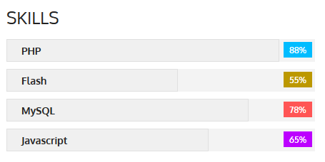
Percentage is set using data-parameter "data-skill='[value]'"
<!-- Skills -->
<div class="sc_skills">
<div class="sc_skills_item first">
<div class="sc_skills_progressbar" data-skill="88">
<span class="sc_skills_progress">
<span class="sc_skills_caption">PHP</span>
</span>
<span class="sc_skills_level sc_skills_level_style1"></span>
</div>
</div>
[...]
</div>
<!-- /Skills -->
Section
Enclose the selected text to the block.
<div class="sc_section sc_section_style1">Lorem ipsum dolor...</div>
Slider
To learn about slider's display visit this section.
Video
Inserts a video file from one of the most popular video hosting services - youtube or vimeo.
<!-- Video -->
<div id="video_demo">
<iframe class="video_frame video_frame_fullwidth" src="http://vimeo.com/20245032" height="250"
allowFullScreen="allowFullScreen"></iframe>
</div>
<!-- /Video -->
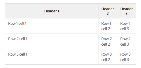
Table
Displays the table
<!-- Table -->
<div class="sc_table">
<table>
<tr>
<th>Header 1</th>
<th>Header 2</th>
<th>Header 3</th>
</tr>
<tr>
<td>Row 1 cell 1</td>
<td>Row 1 cell 2</td>
<td>Row 1 cell 3</td>
</tr>
[...]
</table>
</div>
<!-- /Table -->
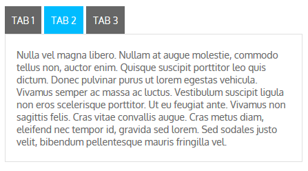
Tabs
Creates blocks with tabs.
<!-- Tabs -->
<div id="tabs_demo">
<div class="sc_tabs">
<ul class="tabs">
<li class="tab_names first"><a href="#sc_tabs_1" class="theme_button">Tab 1</a></li>
<li class="tab_names"><a href="#sc_tabs_2" class="theme_button">Tab 2</a></li>
<li class="tab_names last"><a href="#sc_tabs_3" class="theme_button">Tab 3</a></li>
</ul>
<div id="sc_tabs_1" class="content first">Lorem ipsum dolor ...</div>
<div id="sc_tabs_2" class="content">Nulla vel magna ...</div>
<div id="sc_tabs_3" class="content">LProin sem libero...</div>
</div>
</div>
<!-- /Tabs -->
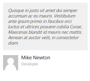
Team
Displays the members of your team (photo with description)
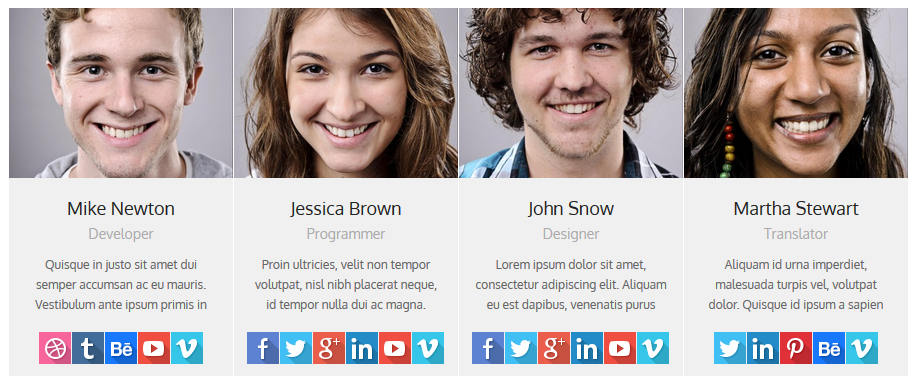
<div class="sc_team">
<!-- team item -->
<div class="sc_team_item">
<div class="sc_team_item_avatar"><img src="[url]" alt="" /></div>
<h3 class="sc_team_item_title theme_title">Mike Newton</h3>
<div class="sc_team_item_position theme_info">Developer</div>
<div class="sc_team_item_description">Quisque in justo ...</div>
<div class="sc_team_item_social">
<a href="#" class="social_icons" target="_blank"><img src="[url]" alt="" /></a>
<a href="#" class="social_icons" target="_blank"><img src="[url]" alt="" /></a>
<a href="#" class="social_icons" target="_blank"><img src="[url]" alt="" /></a>
<a href="#" class="social_icons" target="_blank"><img src="[url]" alt="" /></a>
<a href="#" class="social_icons" target="_blank"><img src="[url]" alt="" /></a>
</div>
</div>
<!-- /team item -->
[...]
</div>
Testimonials
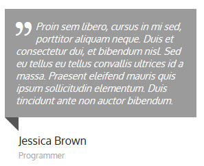
<!-- Testimonials -->
<div class="sc_testimonials sc_testimonials_style_callout">
<div class="sc_testimonials_content">
<span class="icon-quote"></span>Proin sem libero...
</div>
<div class="sc_testimonials_extra">
<div class="sc_testimonials_extra_inner"></div>
</div>
<div class="sc_testimonials_user">
<h4 class="sc_testimonials_title">Jessica Brown</h4>
<div class="sc_testimonials_position">Programmer</div>
</div>
</div>
<!-- /Testimonials -->
<!-- Testimonials -->
<div class="sc_testimonials sc_testimonials_style_flat">
<div class="sc_testimonials_content">Quisque in justo ...</div>
<div class="sc_testimonials_extra">
<div class="sc_testimonials_extra_inner"></div>
</div>
<div class="sc_testimonials_user">
<div class="sc_testimonials_avatar image_wrapper">
<img src="[url]" alt="" />
</div>
<h4 class="sc_testimonials_title">Mike Newton</h4>
<div class="sc_testimonials_position">Developer</div>
</div>
</div>
<!-- /Testimonials -->
Title
Titles may be of several types.
1. Only used for style="bubble_left" or "bubble_top" or "icon_left" or "icon_top". For "bubble_left|bubble_top" - contains the name of the icon that is displayed on top of the icon "bubble":
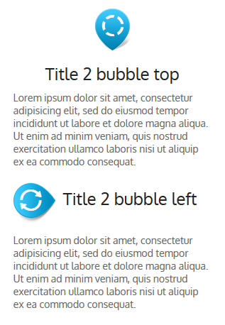
<!-- Title -->
<h2 class="sc_title_bubble sc_title_bubble_top">
<span class="sc_title_bubble_icon icon-spin2"></span>
Title 2 bubble top
</h2>
<p>Lorem ipsum dolor ...</p>
<!-- /Title -->
<!-- Title -->
<h2 class="sc_title_bubble sc_title_bubble_left">
<span class="sc_title_bubble_icon icon-spin3"></span>
Title 2 bubble left
</h2>
<p>Lorem ipsum dolor ...</p>
<!-- /Title -->
2. For style="icon_left" or "icon_top" - contains name of image (without extension) from folder "/images/icons" that is displayed near the title.
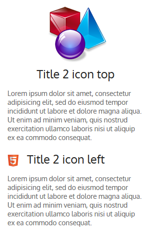
<!-- Title -->
<h2 class="sc_title_icon sc_title_icon_top">
<img src="images/icons/shapes-medium.png" alt="" /><br />
Title 2 icon top
</h2>
<p>Lorem ipsum dolor ...</p>
<!-- /Title -->
<!-- Title -->
<h2 class="sc_title_icon sc_title_icon_left">
<img src="images/icons/html5.png" alt="" />
Title 2 icon left
</h2>
<p>Lorem ipsum dolor sit ...</p>
<!-- /Title -->
PSD files
You will find PSD folder in our archive. PSD fiels will help change design or you may use them at your discretion.
Sources and Credits
This section discloses the sources of various files used within the theme and describes their function. Use this section to gain an understanding on how the theme functions behind the scenes if considering any type of modification.
- Fonts:
- Oxygen (non standard) and other 40 Google fonts
- Fontello (non standard, icons set)
- Arial (standard)
All non standard fonts are from Google Web Fonts and Fontello icons set
We have used the pictures from:
http://www.bigstockphoto.com/
All images are copyrighted to their respective owners and not available for download with this theme.
Additional information from ThemeREX:
“Theme Rex” support team is happy to greet you here! Our operators and developers are always glad to help our customers. Should you have any questions, you may contact us for support:
10.00 – 19.00 (CET), Monday till Friday.
What is important to know about ThemeREX Support Policy
- To get a pre-purchase advice, you may post in the theme’s forum
- To get a response more promptly, you are recommended to use our Ticket-system (just click on banner “Support Sys” on the item page) Important! For correct work of Ticket-system, you mustn’t switch cookies in your browser off
- We try to answer your questions within 5-10 hours. However, if any delay occurs it doesn’t mean that we forgot about you. Some of the issues require testing and analyzing, so we could help you more profoundly
We love to intercommunicate with our customers from all over the world. We always love to explain how our themes work. However, sometimes we have to say No:
- Please, note! We do not support queries if you do not have a purchase code
- Item support does not include:
- Customization and installation services
- Support for third party software and plug-ins
How to find a purchase key (see the screenshot):
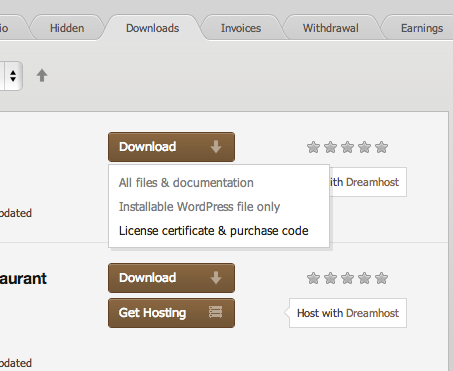
- open the ‘downloads’ tab in your account on ThemeForest
- find our theme in the list of products
- click ‘download’ button, and in the drop down meny select “license sertificate & purchase code”
Social icons
<!-- widget socials -->
<aside class="widget widget_socials">
  <div class="widget_inner">
    <a class="social_icons" href="[url]" target="_blank">
      <img src="images/socials/facebook.png" alt="" />
    </a>
    [...]
  </div>
</aside>
<!-- #widget socials -->
href="[url]" - a link to your social page <a href="http://facebook.com/themerex">
Social Share icons
<!-- socials -->
<div class="post_info post_info_bottom theme_text">
  <div class="share-social theme_info share-dir-vertical">
    <span class="share-caption">Share this</span>

    <a href="#" class="share-item" onclick="trexShareTwitter()" data-count="twitter">
      <img src="images/socials/twitter.png" alt="">
    </a>

    <a href="#" class="share-item" onclick="trexShareFacebook()" data-count="facebook">
      <img src="images/socials/facebook.png" alt="">
    </a>

    <a href="#" class="share-item" onclick="trexShareGplus()" data-count="gplus">
      <img src="images/socials/gplus.png" alt="">
    </a>

    <a href="#" class="share-item" onclick="trexShareLinkedin()" data-count="linkedin">
      <img src="images/socials/linkedin.png" alt="">
    </a>

    <a href="#" class="share-item" onclick="trexSharePinterest()" data-count="pinterest">
      <img src="images/socials/pinterest.png" alt="">
    </a>

  </div>
</div>
<!-- #socials -->